Diving into a brainstorm: ClubMed

It’s summertime. And though I took some trips earlier in the summer, this freelance San Diego copywriter never wants to leave in August because the ocean water is finally warm.

But in honor of our favorite time of year to go on vacation, I wanted to share one of my all-time favorite campaigns with you: Club Med’s "The Antidote for Civilization." It’s an oldie, but it’s a classic! Before this campaign, Club Med was all about showing off the fun you could have at their resorts. But then, they took it to the next level by positioning Club Med as a getaway from the everyday grind.

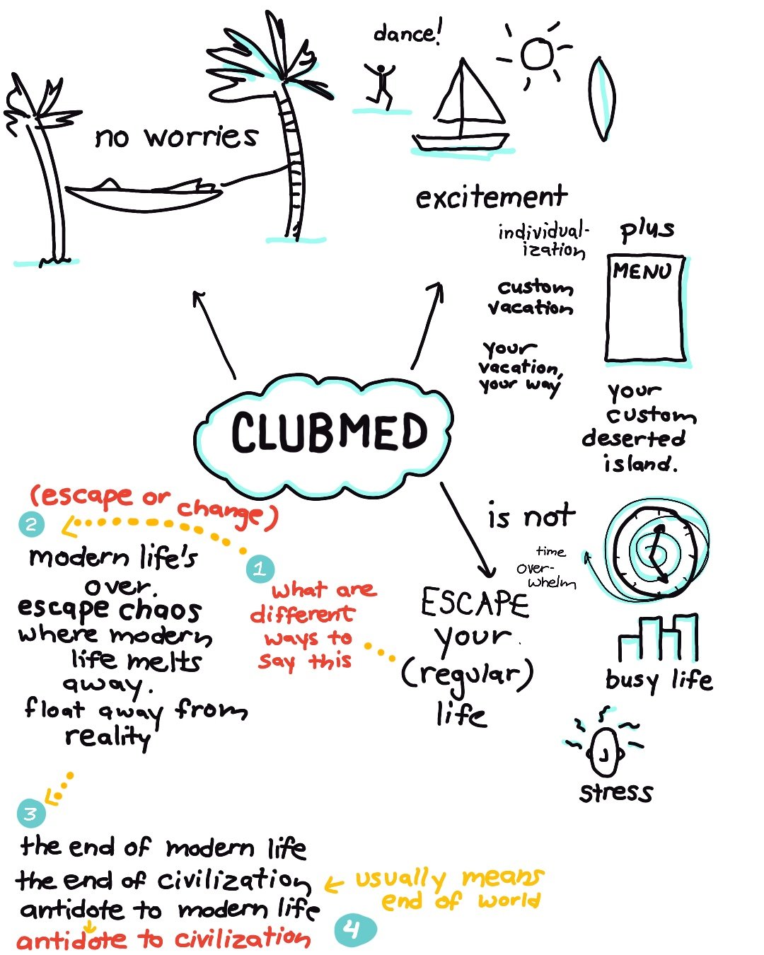
This approach is a great example of brainstorming by focusing on what your product isn’t—essentially, looking at the opposite. So, here’s how I’d brainstorm for Club Med:

 Imagine Club Med at the center of a mind map with these branches extending from it:

  •  No worries

  • Excitement

  • Custom activities/menu

  • Escaping your daily routine

For this brainstorm, we’re going to dive into that last idea: escaping your regular life.

  1. Club Med is all about stepping away from your everyday routine.

  2. We’ll play around with the concept of escape and change.

  3. We’re leaning towards contrasting “civilization” with “modern life” for our final statements.

 Of course, to get here would include dozens of versions of headlines. (Can AI help generate these? You might get a few choice phrases but you are not going to get the “big idea.”

Hope this helps spark some creative ideas!

I need to venti about coffee and branding.

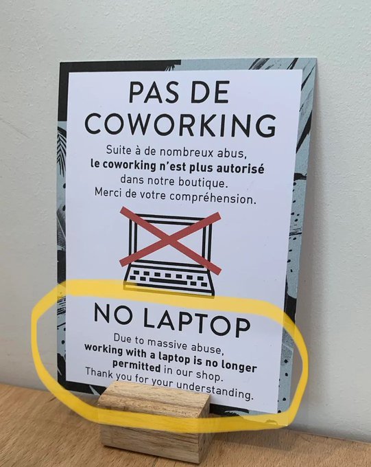
Imagine a café that decided to give laptops the boot because they want people to actually sit at tables, order coffee, and enjoy food, rather than babysit a coffee cup for hours.

So, they slapped up this sign.

So as a freelance copywriter, I naturally thought, there’s a way to put a more positive spin on this so people don't walk away feeling icky.

What’s the opposite of staring at a screen all morning? Yep, talking to someone. Let’s brainstorm ideas that focus on real, human connection.

Connect IRL, Not URL.

Order coffee, eat food, make friends. But please keep your table clear of laptops.

or

Conversations Over Clicks.

We’re big proponents of human interaction. Drink coffee, eat food, share a laugh. But please keep your laptop in your bag.

This is a coffee shop, is there a way to bring a coffee reference into this?

Real Conversations Brewed Here.

During our morning rush hour, 7-9 am, please leave your laptop in your bag.

Screens can be an addiction. Let’s play off of that.

Digital Detox Zone.

Let’s drink coffee, eat cake, and keep our laptops closed 7-10 am.

Do you have any ideas for better messaging for this?

What happened to the third space?

Starbucks grew on the promise of being that third space. Not work, not home, but a special place. Customers could enjoy all the comforts of home: sit in a comfy chair, stare out the window, talk with a friend, and drink coffee. It was about connections and community, not just the coffee.

Then CEO Howard Schultz nailed it, saying, “I’ve never thought of the third place just as a physical environment. For me, the third place has always been a feeling. An emotion. An aspiration that all people can come together and be uplifted as a result of a sense of belonging.”

The concept of being a third space was Starbuck’s differentiator. It was their thought-provoking POV.

But then they grew, cut costs, and it just became about the coffee.

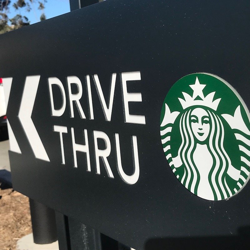
Starbucks leasing agents are the best in the business. They know how to maximize every dollar per square foot. So, at the height of COVID, Starbucks closed their local shop that had sofas inside and tables outside and no drive-through and built a new Starbucks from scratch. To their credit, they laid out the drive-through lane first and then built the store. Now there’s only outside seating (which you can use almost year-round in San Diego). And probably 95% of their business is now drive-through rather than walk-in.

Starbucks now sells coffee, not community. And so does McDonald’s, which is cheaper.

Starbucks lost their differentiator. So if you want to have a cup of coffee with this San Diego freelance copywriter, this is the neighborhood cafe that I’ll take you too. (It appeals to my love of sketch art.)

What makes your business different? What’s your thought-provoking POV?

DIYFamilyFilms Nails It

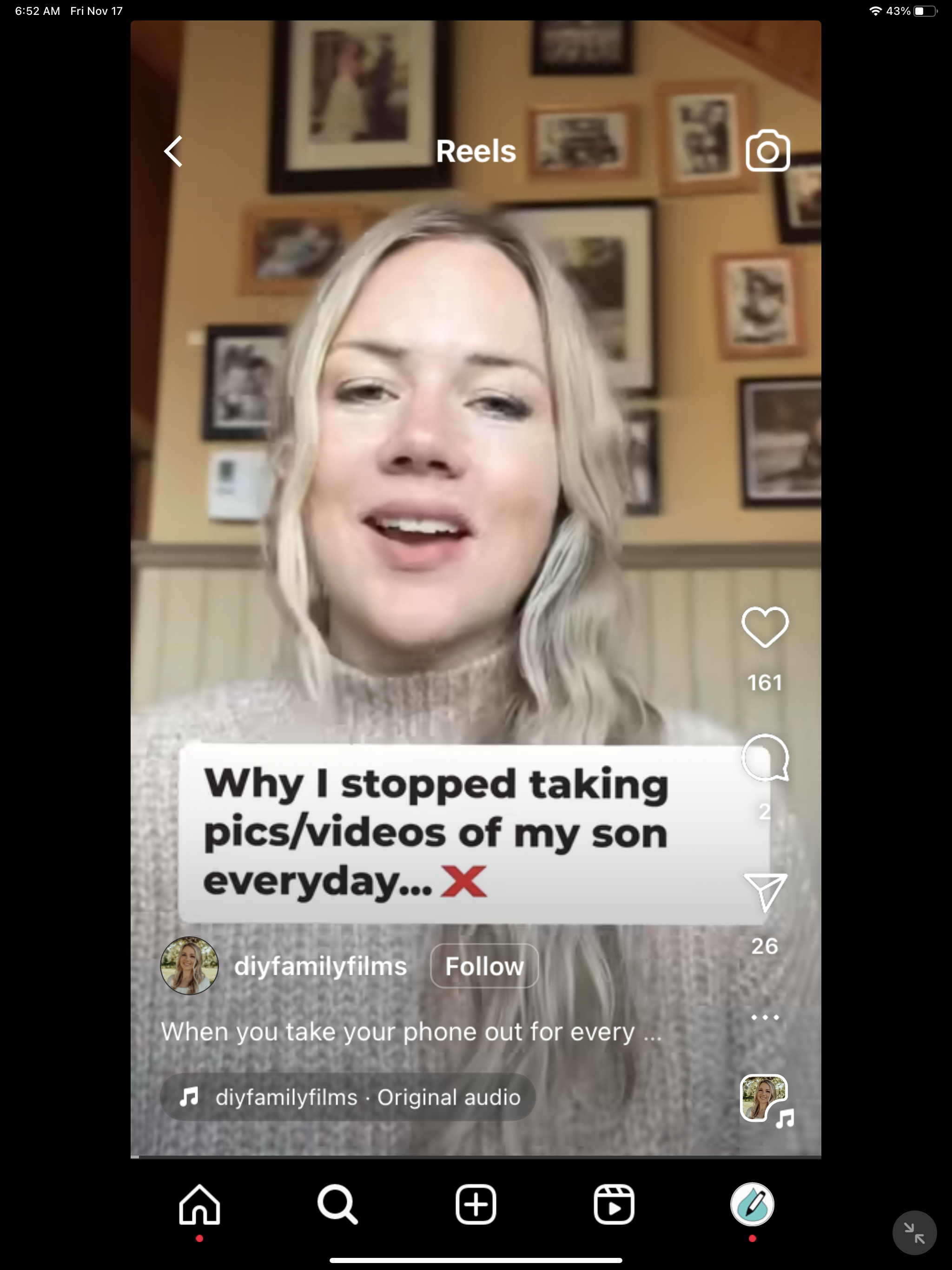
Alright, buckle up, because DIYFamilyFilms just dropped an ad campaign that's the equivalent of a marketing mic drop. I'm scrolling through my feed, and bam! An iPhone video course that hits differently. (I haven’t bought it yet but I’m going to! And no, this is not an affiliate venture.)

Let's dissect the brilliance:

The Head-turning Hook

Lead Message:

"Why I stopped taking pics/videos of my son every day."

Hold up, did a photography/video course just lead with not taking photos? Genius. It's unexpected, it's attention-grabbing and head-turning.

Opening Text

"When you take out your phone for every cute moment because you don't want to miss it but you end up with a ton of digital clutter."

And just like that, we're all nodding in agreement. Founder Tenille is in our heads, she gets it. Digital clutter? Guilty as charged.

Understanding Parents

"Time with your child is so precious and you don't want to forget the special moments. I get it."

Yes, you get it, and now we're hooked. Speak our language, sister!

The Sell - Benefit First

"Reduce digital clutter and screen time by learning how to use your phone properly to create home videos that you actually want to watch."

Not diving into course features but hitting us with the benefits. Unexpected benefits, mind you. Reduce digital clutter? Sign me up. Reduce screen time? Double yes.

The Pitch

"Learn the DIY family films method once and have a skill for life. Get 70% off our easy way to follow course built for busy parents! Works with iPhones and Androids."

A skill for life? Check. Discount for busy parents? Check. Works with both iPhones and Androids? Check and mate. This is a pitch with a punch.

Website Check

Clarity Line

Boom, instant clarity on what the course is about. No beating around the bush.

Overcoming Objections

She's a parent like us, low-tech on the phone, reduce screen time, stuff you won’t find on YouTube. Objections crushed, moving on.

Before and After

Instead of the cliché before and after, she labels it "Digital clutter to home movies." It's not just clever; it's a visual punch in the face.

DIYFamilyFilms isn't just selling a course; they're selling a solution to a problem we didn't even realize we had.

Bravo, bravo!


Unsubscribe | Update your profile | 8885 Rio San Diego Dr #237, San Diego, CA 92108

Bears Be Aware: Edit a sign, save a life.

I was on a trip to Montana with childhood friends on their annual trek to their grandparents’ ancestral home.

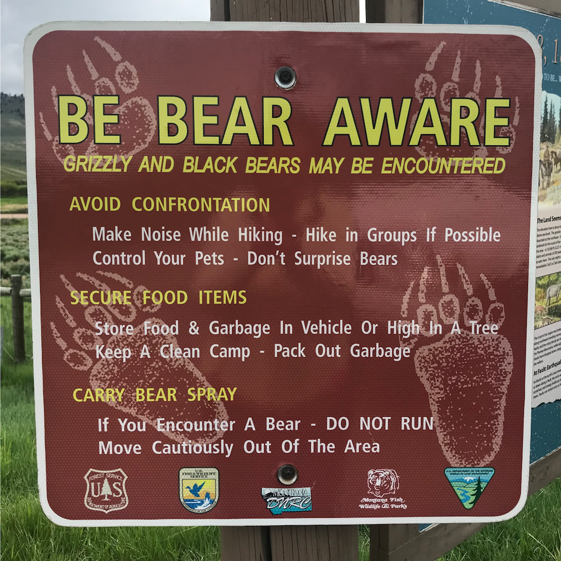
At a trailhead, I spotted this mini-guide for bear survival that is a great lesson in information hierarchy. I love it: It has a cute attention-grabbing headline that rhymes: BE BEAR AWARE followed by a clarifying subhead. The information is broken down into three sections:

  • Avoid Confrontation

  • Secure Food Items

  • Carry Bear Spray

I would suggest they change the third subhead, though. While carrying bear spray may be helpful, for any visiting city slickers, it’s probably more important to know not to run.

Here's how I would revise the third subhead and copy:

DO NOT RUN.

  • Carry bear spray. Move cautiously out of the area.


I would also switch the 2nd and 3rd blocks of copy as I think it’s more important to tell people not to run than to secure their food. (Though if they don’t secure their food, the bears will come, so it is all important.) The edited sign looks like this:

Now for the final edit. I would cut copy length because the shorter the copy, the greater the chance more people will read it.

BE BEAR AWARE

  • Grizzly & Black Bears May Be Encountered.

AVOID CONFRONTATION

  • Make noise while walking. Hike in groups if possible. Control your pets.

DO NOT RUN

  • Carry bear spray. Move cautiously out of the area.

SECURE FOOD ITEMS

  • Store food & garbage in vehicle or hang in a tree. Keep a clean camp. Pack out garbage.


Rick Rubin and the Creative Act

I was impatient and ordered the kindle edition of Rick Rubin’s book, The Creative Act: A Way of Being. It’s a book of short self-contained  chapters so you can pick it up and read a blurb for a dose of inspiration.  (And really, I could create a graphic this long for each chapter, it really is a quotable volume.)

Considering all the recording artists that Rubin has worked with, he doesn’t name drop. A couple of times he gives a specific example of how he has coached an artist but you are left to guess who. 

In making art, the audience comes last. - Rick Rubin

This quote hit me because it reflects the difference between art as self-expression and using creative art to sell a product. As a creative professional, sometimes my copywriting or graphic recording can approach art, but it still has a purpose to sell, clarify or inform. 

Yesterday I was in a session with a team and we were selecting what campaign ideas to refine. There was one campaign that was clever and everyone loved. But it was a longer read and wasn’t as clear, it wouldn’t serve the client as well. We had other campaign directions that could delight a customer and sell the product that we chose instead. 

5-minute Homepage Makeover for a Restaurant

Does your website pass the 5-second rule?

Can a viewer find out what you do within that period of time? (And, preferably, fall in love with your services or products?)

I came across a site that needed help with the falling in love part.

Some members of my extended family were in town, and we were to go to a restaurant to dine with some even more extended family. I checked the restaurant’s website for the address before setting out, and noticed that the site looked like it was from 2008.

The website didn’t make me excited to go visit any of these waterfront restaurants.

Yawnsville.

There are two things I would immediately do to improve it.

  • Write a big, beautiful, benefit-driven headline to sell the stunning waterfront locations.

  • Use big photos to showcase those locations.

(Because dinner is always more fun when you can watch sea lions sunbathe on a dock and witness standup paddleboarders fall in the water.)

 Watch this video  to see a quick makeover.

Your homepage is such valuable real estate. Make sure you make the most of it.

I hope this helps you!

Write on! :)


DIY Branding Workshop Templates!
Over the past six months, I have been experimenting with a new DIY brand voice workshop that I have been using with clients and in the copywriting classes I teach. It's free and I thought you might want to give it a try.

It's based on the 3-Hour Branding Sprint developed by the folks at Google Ventures. I've adjusted it a bit. It's perfect for solo buisness owners and small groups. Try it out and let me know what you think!


content_branding_workshop.png


Can you explain your brand?

If not, use these simple exercises to make the idea of your brand into something concrete. If It’s just you, just print out this handbook and doodle away. If you’re part of a team, draw these diagrams on large sticky note posters. After you’re done, you (and your team) should have some common language to describe you’re your brand is all about.

content_noteandvote.png

Note and VoteBranding is one of those things where you can talk for hours and hours and still note make a decision. Note and vote limits your discussion time and allows quieter people to be heard.

How to make decisions quickly.

  • Time to generate ideas: Everyone gets a Sharpie, a pad of sticky notes and the permission to go crazy for two minutes. One idea per sticky note. No self-editing. The idea is to generate a lot of ideas.

  • Narrow down: Then, the timer is set for two more minutes, while each person selects their favorite idea or two.

  • Share: Now it’s time to share. Everyone shares their ideas while one person records them. Next, another five minutes passes while everyone individually picks out a favorite idea from the whiteboard and writes their vote down.

  • Ta-da: The votes are revealed and noted on the whiteboard. One person, the “decider,” (who is chosen in advance) makes the final call on which idea to go with. (The decider is the CEO of your company.)

content_timeline.png

Your Mission

Where are you going to be in one, five, and ten years? Taking a long term approach helps you focus on the big picture.

content_brand_pillars_.png

Guiding Principles

List your guiding principles. It’s easy to list 20. But it’s hard to narrow them down to three. This is your point of difference.

content_audience.png

Audience

Who is your audience. You might have many. But focus on the top two or three. Ask yourself, what do they care about? What’s their problem that we can solve?

Draw an audience pie chart and label what their top need is.

content_discover_your_why.png

What, How, and Why

When you know why you’re in business and have a unified way to talk about it all of your marketing and communications fall into place.

The What – Please write a phrase or sentence describing your primary business for the next five years. Examples: We make tacos. I am a financial coach.

The How – What’s our secret sauce? What technology or approach sets us apart from the competition? Examples: We make our tacos with fresh ingredients. I help people gain finyancial literacy.

The Why – You can think of the "why" as the reason you get out of bed in the morning and go to work. The "why" should reflect the core reason your company exists, and it won’t change much over time. Examples: We sell food with integrity. If you don’t plan your future, who will.

This is adapted from Simon Sinek’s Golden Circle.

content_brand_personality.png

Brand Personality

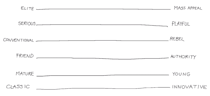
Where does your brand voice fall? You can fall to the left in some ranges and fall to the right in others. That’s okay. What you don’t want is your brand voice landing in the middle of everything. That’s bland and boring.

content_competitive_landscape.jpg

Landscape

Take a sticky note and place where your company is in comparison to the competition. You might want to change the labels to fit your industry. For example, you might use high tech/no tech. Or business/inspiration. Corporate/casual.

Ta-da!

Here you have it, simple beginnings of a brand guide. Use it to help drive your messaging. Or bring it when you engage a social media person, web developer, designer, or copywriter.

Get your copy here.

Clarity Wins! Branding Workshops

If you would like me to lead you or your team through a Clarity Wins! Branding Workshop, just hit me up at stories@annemccoll.com!

Happy writing! :)

anne_heart.png


Brand Safari: A visit to Breakfast Republic

branding_safari_anne_mccoll.png

Brand Safari: Sightings of great work in the branding jungle.


It was the first week of the new year and I was meeting a girlfriend for breakfast at Breakfast Republic down at Liberty Station. As a San Diego freelance copywriter, I immediately was drawn to how copywriting was able to contribute to a fun experience. This is where creativity–not budget—makes a big impact.

cofee_copywriting

While I was waiting for Lex, my tea was delivered in a mug that equated coffee consumption with early morning clarity.

menu_copywriting

A whimsical chicken character lived inside the menu and commented on menu items.

wrapper_copywriting
packaging_copywriter


And Breakfast Republic didn’t miss a chance for branding fun with napkin wrappers and a line of sauces and toppings they carry.

IMG_1376.jpg


Well done! Well done! (And the company and conversation was pretty great too.)

How can you share bits of humor and humanity as your customers experience your business?