The creative tribes gather at CuriousitY19: The AIGA San Diego Y Design Conference

It was another two days of creativity and community at the Y Design Conference. My two favorite speakers were our local heroes. Architect Rob Quigley spoke ever so eloquently about keeping true to original intent whille designing the new Central Library. And Ron Miriello shared his take on life/design/life with the enthusiasm of a beginner tempered with the wisdom that only comes with experience. There is always the reacurring theme of become your own client and create your own projects.

How much did it cost Yahoo! to redesign their new logo in-house?

In a highly publicized move, Yahoo! redesigned their logo with design efforts led by CEO Marissa Mayer. She says in an article in Ad Age:

"On a personal level, I love brands, logos, color, design, and, most of all, Adobe Illustrator. I think it's one of the most incredible software packages ever made. I'm not a pro, but I know enough to be dangerous :) So, one weekend this summer, I rolled up my sleeves and dove into the trenches with our logo design team"

Obviously, Yahoo didn't design their new logo in-house because of economic reasons.

YahooLogoAnneMcCollSM

Oops. I forgot to add in the price of pizza.

See a big version here.

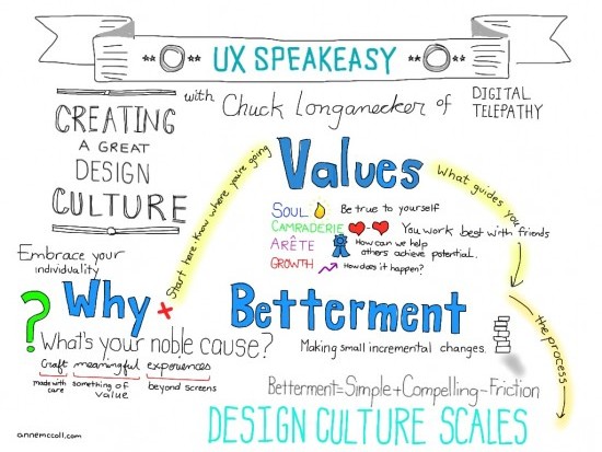
Cultivating a Design Culture: Sketchnotes from UXSpeakeasy

The UXSpeakeasy group consistently has great programming (and beer.). This month's event covered how to cultivate a design culture and featured Chuck Longanecker of digital-telepathy. The event was held in their new space that formed housed one of my favorite places, the Hive. Chuck shared how digitial-telepathy has evolved over the years. What's a design culture? It's more than having a foosball table or lunches on Friday. It starts at the top and engages every aspect of the company.

This was a challenging session to sketchnote, so much wonderful information coming out at once. Graphic facilitator extraordiaire/Stick Figure Strategist Jeannel King was also there and sketched. I glanced over her shoulder and it was fun to see how differently we interpreted the material. I asked her for suggestions on how to represent Soul. (She is amazing because she uses marker and pen while I do more with the iPad.)

UXSpeakeasy: Cultivating a Design Culture

See the big version here.

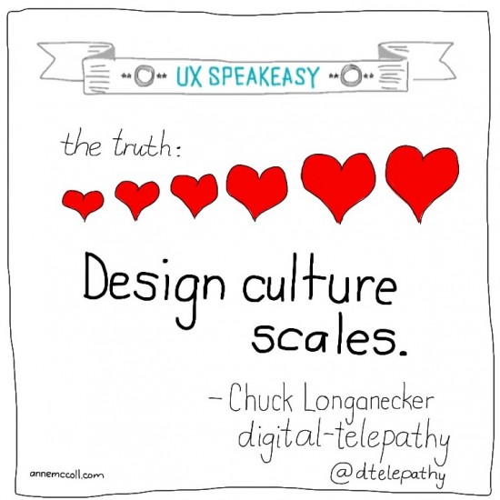
UXSpeakeasy: Potential

UXSpeakeasy: Design

San Diego AIGA Y18 Design Conference Sketchnotes and Live Designs

It's funny how every Y-Conference seems to reflect an underlying theme. This year's was that side projects and pro-bono work can lead to other assignments. Wayne White spoke how he played with puppets and that led to his work on Pee-wee's Playhouse. Brian Singer shared his many side projects including 1000 Journals. Eric Thoelke shared how doing work for the local opera company evolved step by step into more client work. And Josh Higgins shared how his pro bono poster work led to working with the Obama Campaign.

Below is a selection of images that I live tweeted during the conference including sketchnotes of presentations and highlighted quotes. All design done live during presentations. (Yeah, I felt weird, one of the few non-designers in an audience of designers tweeting designs but all very much of the moment.)

Why I love the Y.

The gathering of the faithful.

Design conferences are kind of like old-fashioned tent revivals that southern churches use to hold. Once a year, you need to re-energize your faith, stand up and say, "Amen, I believe, sistah!" So once a year, I take some time out, turn off the email and drink some of the creative Kool-Aid at the AIGA Y16 Design Conference. As a self-employed creative with well-trained clients that I communicate with via email, it's all too easy to work in a vacuum.  I have to go out of my way to collaborate and reconnect with other creatives. The Y is one of the the best ways I have found to spark my  creativity  and remember the reasons why I got into this business to begin with.

Design by Aaron Draplin for print screening with Sezio.

Makin' shit.

The Pacific Northwest made a strong presence at the Y with Aaron Draplin of Draplin Design Company. (Tagline: Midwesting the Northwest.) Aaron charmed everyone with his candidness and ability for telling it like it is. He is a big proponent of doing creative work whether or not you have a budget. “There’s equity in helping people,” he said. He encouraged designers to “be the client and make shit happen.” We were challenged to get out there and get dirty. He closed his talk and set the mood of the conference with these gems:

  1. Work hard and love this shit.
  2. Say yes maybe a little more than you say no.
  3. Do good work for good people.

The shape of design.

Fellow Portlander Frank Chimero took a more cerebral approach to design, asking the questions behind why we do the things we do:

  • How vs. Why.

How is about being capable and taking your tooks and forcing them to your will. Why is about the reasons we do things, and often, this part of the conversation is neglected.

In the relationship between message and format, designers deal with the tone.

  • Message (what you’re saying)
  • Tone (this is the area designers deal in, the bridge between message and format)
  • Format (what is the medium: web, poster, print, ad, brochure)

Frank urged designers to explore beyond the tone and become the client – becoming responsible for content. “If I’m assigned an article and it’s crap, I can’t come up with a good illustration.”

Other speakers were fabulous. Illustrators and design duo Sarah Labieniec and Ryan Meis of Lab Partners were simply delightful in their story of how they work together. (Love my husband but I could never work with him.) Peter Kragh shared details about his job – swimming with great whites while filming IMAX films. (What's his life insurance like?)

Thinkshops.

Thinkshops were smaller, more intimate workshops. To balance the creative inspiration of the mainstage speakers, I selected more practical Thinkshops. Luke Mysse of Crossgrain led a Thinkshop on how to hire clients and the steps you can take to market yourself to attract the type of clients you want. The insights I gained from this workshop were the most important ones I took home from the conference.

Thomas Marchesello of Nine Multimedia shared how to create killer aps. The secret to good app design he said was “ to think in layers.” Thomas mentioned why you always have to entertain with an app: “Just think about it, what’s on your phone is personal –  it goes in your pocket.”

Hanging with fellow design freaks.

But perhaps the best part of any conference is what happens outside the auditorium. The sharing, the interaction and meeting of fellow design nerds. Who else would agree to try out a new restaurant just because the graphics were so cool?

Why go to the Y? I guess Frank may have said it best, “We come together to get better.”

Spark your creativity.

I have had the honor and great pleasure working on communications for the upcoming AIGA San Diego Y-Conference. Justin Skeesuck of Seen & Noted and Tracy Meiners of StudioTM headed up the design efforts. This year's theme is Spark. Spark an idea. Spark a conversation. Spark a revolution.

Check out the website here.

Tracy did an amazing job on the mailers, which are designed at matchbooks. (Kids, don't play with matches but you can light a match.)

There's more to Cabo than Cabo Wabo.

Hacienda is the place where Sinatra, John Wayne and Raquel Welch hung out back in the day when Cabo San Lucas was a sleepy fishing town. Times have changed but Hacienda is still the place in Cabo, just steps from the marina and downtown. (And speaking of Cabo Wabo, Sammy Hagar made 200 million licsensing his booze brand!)

Visit the site here.

See the brochure:  Steps

Fun at boygirlparty.com

One of the most amazing things about coworking at theHIVE is meeting all the diverse creatives that work here. Of course that means a simple trip to the kitchen can take a 1/2 an hour because you have to stop and chat and check out their latest projects. One of the newest Hivers is Susie Ghahremani of BoyGirlParty.com who can often be seen hunched over working on her fabulous illustrations. She paints. Yes, she paints!

What I admire about Susie (well besides the fact that I LOVE her illustrations) is how well rounded she is.

First of all, she's a successful editorial illustrator who's worked with the likes of Martha Stewart, the New York Times and Craft: Magazine.

She's got a great website where you can view her work and shop.

And she still has time to do her own work to participate in shows. You can catch her creations this Saturday, July 10 at Ray at Night, an art event in North Park. Her art opening is hosted by Warp 9 Imaging at 3820 1/2 Ray Street. She'll be showing 25 minature paintings and other work.

You can see all of Susie's work at boygirlparty.com.

Follow her on Twitter @boygirlparty

photos courtesy of boygirlparty.com

The most important infographic of all time.

The year was 1972. Moon walks were recent history and space exploration was all the rage. (And glory of glories, Tang was still sold at the grocery store.)

NASA sent out the unmanned Pioneer 10 as a sort of calling card to the universe. It was the first spacecraft to leave the solar system. This plaque was mounted on Pioneer 10 to help aliens figure out something about the beings that launched Pioneer.

So we have a nude male and female. The man raises his hand in the classic "How" position. Even if the aliens don't know this is our way of saying hello, at least they'll be able to check out our opposable thumbs.

There's a couple of diagrams including "a schematic representation of the hyperfine transition of hydrogen, which is the most abundant element in the universe" and "hydrogen spin-flip transition frequency."

Then there's the nifty diagram of our solar system.

This infographic reveals almost as much about the era it was created in as about the location of our home planet.

If it was created today, would the content differ?

Hopefully the aliens will be able to figure it out.