When online and offline collide: Sharing your Instagram shots IRL.

With 300 million users uploading 21.9 billion photos on Instagram last year, we’re taking and sharing more photos than ever before. But the funny thing is, we’re printing fewer and fewer of them. Instagram may have the highest engagement of any social network, but you can also engage people by printing out your Instagram shots. The intersection of online and offline is my favorite place to hang. Here are a couple creative ways to share your favorite photos.

An Instagram business card.

Sue B. Zimmerman is The Instagram Expert, a high-energy entrepreneur who helps growing businesses find and connect with their audiences on Instagram. Is it any surprise that her business card is an Instagram shot of her in an Instagram frame? Sue's contact information is printed on the back. These are Mini Squares printed by Social Print Studio, a fun online studio that prints your Instagram shots. (I am not an employee, I simply love their products.) And yes, several months after meeting Sue again at #smmw15, I still have her business card pinned up on my bulletin board. How's that for brand engagement?

Cards Against Banality.

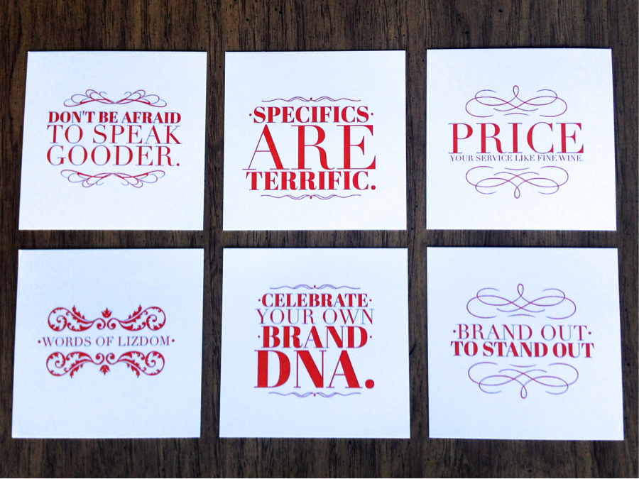
Branding expert Liz Goodgold is a speaker and author of How to Speak Gooder: Brand-New Rules for Public Speaking in a Digitally Distracted World.

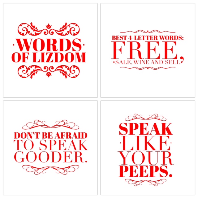
Liz’s talks are the epitome of  “edutainment” – blending information, education, humor, and real-world examples. She is known for her Words of Lizdom, a collection of wise and punny aphorisms. As a holiday gift I designed a card set of her Words of Lizdom. (Large format Squares from Social Print Studio.) I know Liz got a big kick out of them and appreciated the personalized gift.

.

The Word Book

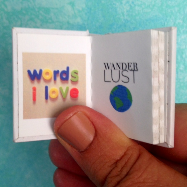
In the writing world, November NaNoWriMo is National Novel Writing Month where writers commit to writing the first draft of a novel. While I couldn’t commit to writing 1,600 words a day, I could commit to writing 1 word a day. So every day for a month, I created a word image on mobile devices, using a combo of photo, Over and Brushes and posted the word image on Instagram. At the end of the month I printed a tiny book, My Favorite Words.

I sent My Favorite Words out as a holiday promo to my clients. It was a big hit, many even shared the book on Instagram. Now, over a year later, when I visit their offices, many clients have the tiny book stuck on a filing cabinet. (The back cover contains a magnet! Yep, printed by Social Print Studio.) This is the beauty of print, if you create something precious, people will keep it, providing a lasting branding message.

Do you have any crafty Instagram ideas? Share them on Instagram and tag me: @annemccoll.

If you want more insights on storytelling and creativity in business, sign up for my newsletter!


Digital addiction: cigarettes, food, sex, and selfies.

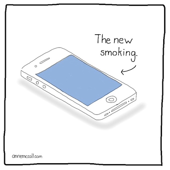
digital_addiction So. I love my iPhone.

At a seminar earlier this year, Interactive pioneer Todd Purgason said there’s never been a great creative tool for self-expression. It’s true. You can take photos. Film videos and create art.

The iPhone is also addicting. It’s like a window into another reality where you can leave your current existence.

Yesterday my history-obsessed daughter and I were discussing the origins of the term alpha and omega. Quickly at a stop light I googled omega to see what latin letter it stood for. Thank you iPhone, instant knowledge. Instant gratification.

Yet, when my husband is driving it’s too easy for me to get on my iPhone and miss the opportunity to talk to him.

Why do I keep feeling a need to go back to my iPhone?

It's all about dopamine. Dopamine controls the pleasure systems of the brain and motivates you to seek out pleasures  food, sex and drugs. So when you get a response to a text, it's a shot of dopamine. When you find an answer you Googled, it's a shot of dopamine. And our body always wants more. More. More.

Up next:

A 12-step program for iPhone addicition.


For more creative insights on storytelling, be sure to sign up for my not-too-frequent newsletter!

Happy creating!

anne_signature


Adobe Voice: Great for telling stories, not so great for sharing stories.

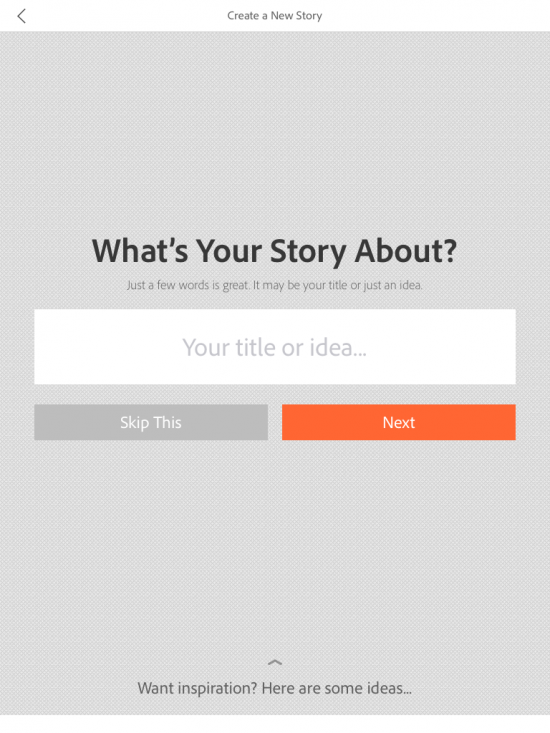
adobevoice Adobe released a new story telling app for the iPad called Adobe Voice. It’s a simple and really fun way to make voice-driven explainer videos.

You begin by recording a short audio recording. (Don’t worry, there’s a magic automatic make your voice sound better element included.) You can then add royalty free icons, photos or text—or you can upload photos from your iPad. You have a choice of 30 or so themes with set fonts and transitions and a limited selection of background music.

Here's a short video I created with Adobe Voice:

Simplicity = success. You’re only limited to a choice of 5 different layout per slide. While it would be nice to be able to tinker a bit more, the strength of Adobe Voice is in its simplicity. The average person will be able to create a nice looking video without knowledge of typography or design. There are even prompts that ask you about your story if you don’t know how to proceed. Yes, you can do a lot more with programs like iMovie, but Adobe Voice lets you create a beautiful piece in minutes.

Sharing is caring. To share your Adobe Voice video you have to upload it to Adobe’s servers requiring you to create an Adobe Cloud account. From there you can share on Facebook, Twitter or use an embed code. While the player page is beautiful, it gives you no indication of how many views. or where the video has been shared. I would really like to be able to save the videos onto a device (useful for kid’s homework) or to be able to upload to YouTube, to be able to leverage the searchability of the Internet’s second largest search engine.

Rating: Creative: Excellent Social: Fail


For more creative insights on storytelling, be sure to sign up for my not-too-frequent newsletter!

Happy creating!

anne_signature

Sketch your own blog visuals!

Okay, it’s official, the Pinterestification of the Internet is now complete. Every blog post must have an interesting visual that can be used as an icon to promote it on Pinterest, Instagram, Facebook and wherever else. So what do you do? Go to iStock and find that highly original target or light bulb like everyone else?

Yawn.

Instead, draw your own. And no, you don't have to be a designer or an artist. You can just be a regular blogger, writer, or copywriter.

Who me? Yes, you,  seriously. Grab a Sharpie. Draw on a stickie. Snap a shot. Upload. You’re done.

Here are two people who sketch their own visuals with style.

Shelly Bowen of Pybop.

pybop_responsive Shelly Bowen is the simply amazing principal of Pybop, a content strategy consultancy. Go ahead and take a look at the Pybop (which stands for Put Your Brains on Paper) blog page. See what a consistent look and feel they create. And Shelly spends $0 on visuals!

Amber Rae of  HeyAmberRae.com

HeyAmberRae Amber Rae is a one-woman powerhouse and CEO of the Bold Academy, an accelerator program that teaches would-be entrepreneurs and creatives how keep it real, take risks, and boldly pursue that which they feel called to do. Her Ambergrams capture her bold way of thinking and are often snapshots of her Moleskine musings. Her sketches were even used in a Fast Company profile.

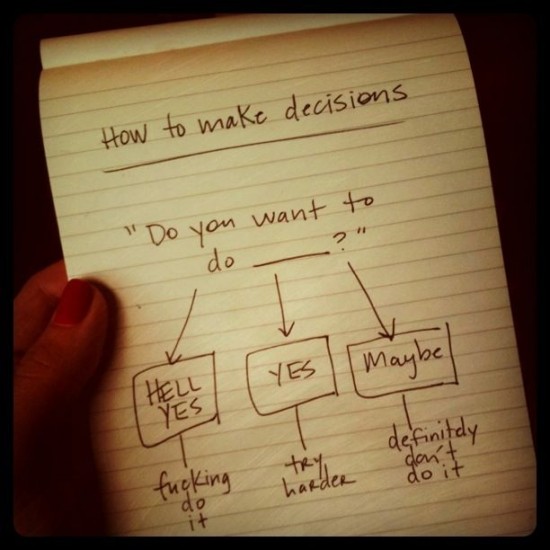
It’s impressive how a diagram and just a few words can communicate so much.

Do you know anyone else who scribbles their blog post visuals? Let me know!

anne_signature


For more creative musings, you can always subscribe to my newsletter.
Creative Cocktail: The workshop

At Hera Hub, the co-working space I've been working out of for the past two years, they have weekly roundtable discussions call Business Boosters. This week I led a workshop called Creative Cocktail at each of the three Hera Hub locations in Mission Valley, Sorrento Valley and Carlsbad.The premise: a creative copywriter asks is it really like Mad Men where you drink 3 martinis and then write great ads? In this class I led an exercise how to think visually and how to mix hooks for creativity.

Of course, I made a promo video.

How much did it cost Yahoo! to redesign their new logo in-house?

In a highly publicized move, Yahoo! redesigned their logo with design efforts led by CEO Marissa Mayer. She says in an article in Ad Age:

"On a personal level, I love brands, logos, color, design, and, most of all, Adobe Illustrator. I think it's one of the most incredible software packages ever made. I'm not a pro, but I know enough to be dangerous :) So, one weekend this summer, I rolled up my sleeves and dove into the trenches with our logo design team"

Obviously, Yahoo didn't design their new logo in-house because of economic reasons.

YahooLogoAnneMcCollSM

Oops. I forgot to add in the price of pizza.

See a big version here.

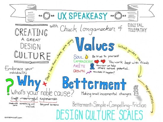
Cultivating a Design Culture: Sketchnotes from UXSpeakeasy

The UXSpeakeasy group consistently has great programming (and beer.). This month's event covered how to cultivate a design culture and featured Chuck Longanecker of digital-telepathy. The event was held in their new space that formed housed one of my favorite places, the Hive. Chuck shared how digitial-telepathy has evolved over the years. What's a design culture? It's more than having a foosball table or lunches on Friday. It starts at the top and engages every aspect of the company.

This was a challenging session to sketchnote, so much wonderful information coming out at once. Graphic facilitator extraordiaire/Stick Figure Strategist Jeannel King was also there and sketched. I glanced over her shoulder and it was fun to see how differently we interpreted the material. I asked her for suggestions on how to represent Soul. (She is amazing because she uses marker and pen while I do more with the iPad.)

UXSpeakeasy: Cultivating a Design Culture

See the big version here.

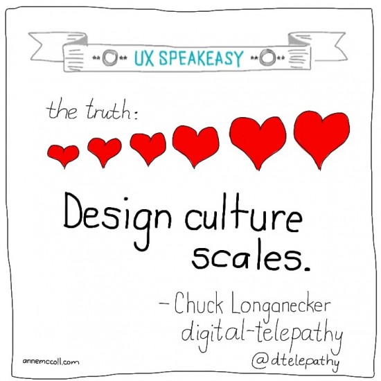
UXSpeakeasy: Potential

UXSpeakeasy: Design

Is creativity still king?

The San Diego Ad Club sponsored an interesting forum on creativity and agencies. Is creativity still king?

In a short word, yes.

There's more people producing sites and video and blog posts. More volume. More crap. It's easier than ever for a great idea to stand out, if only people see it.

However, the days of a copywriter and art director going off to a room to concept for a week are over. This whole working in a silo has to end.

But on the other hand, someone has to steward the idea through production. Creative by committee tends to produce watered-down ideas.

What's your experience?

Sketchnotes and Sketch tweets from #smmw13

Social Media Marketing World hosted by the folks at Social Media Examiner came to town for a few days. I created sketchnotes and sketch tweets during the sessions and tweeted them out. All visuals were created on the fly using the iPad and Brushes and Over apps. One surprising theme – don't discount your email list. It will be the most profitable.

The antidote to iStock: Your iPhone.

Nothing can bog down your blog post more than a boring, predictable visual. (Hello iStock.) So what is a blogger to do? Well, look no further than your iPhone. There are some amazing apps that make creating a visual fun and easy. Here are a few of my favorites. Over Over adds text to photos. You can select fonts, alignment, size and color all within the app. (No more layers in Photoshop.) annemccoll_copywriter

Take a picture. That's right. Don't be shy. Draw on notepad, a white board and post. anne_mccoll_content

Vine Vine is a new six-second video app.And it makes making stop motion animation easy! How could you use it? Pin up your products one by one?