A chain reaction.

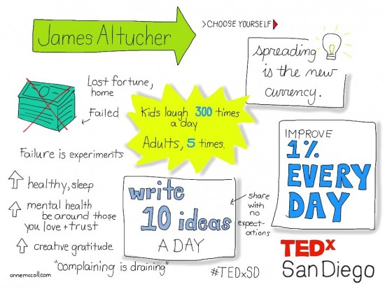
I had the great honor and pleasure of sketchnoting the TEDx San Diego conference. Previously I had attended the 2010 and 2011 TEDx events. (But when the event was moved to the Saturday during the holiday season I couldn't make it!) With 700 attendees, this event was much larger than the first event of 150 attendees but was able to reach a much wider audience.  

chain_cover


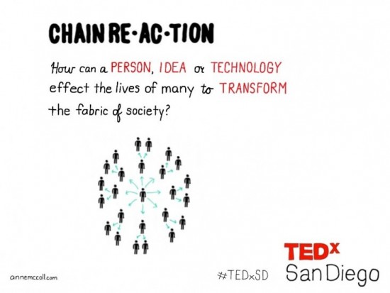
chainreaction


beprepared


venue


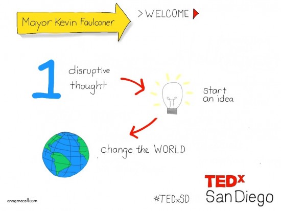
Faulconer_talk


Faulconer_quote


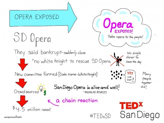
Opera_talk


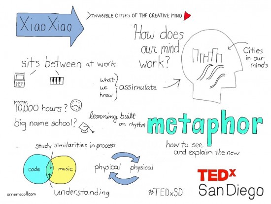
xiao_talk


xiao_quote


Crawford_talk


Crawford_quote


Horowitt_talk


Horowitt_quote


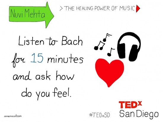
Mehta_talk


Mehta_quote


Voytek_talk


Voytek_quote


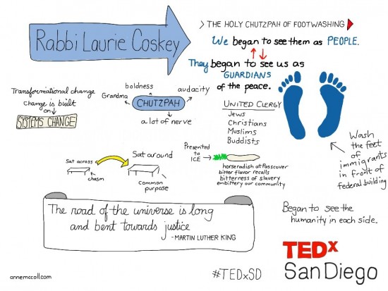
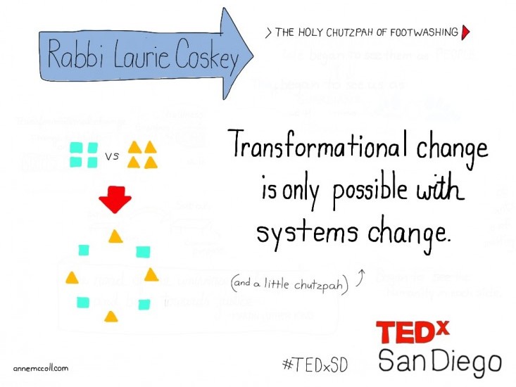
coskey_talk


coskey_quote


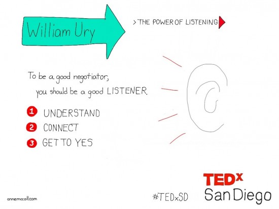
WUry_talk


WUry_quote


Nacif_talk


Nacif_quote


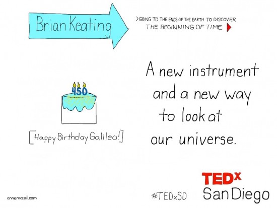
Keating_talk


Keating_quote


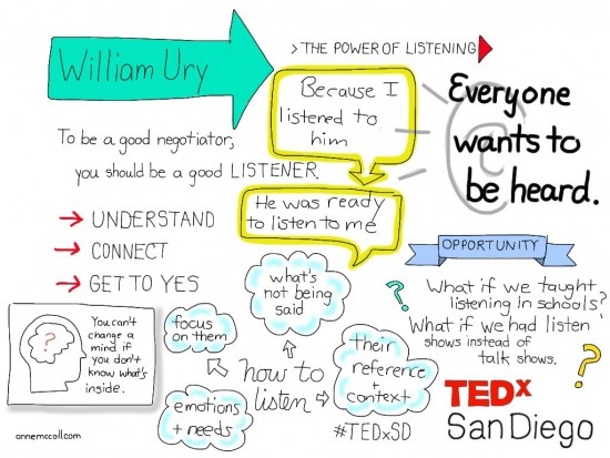
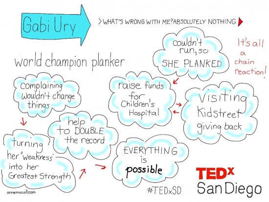
GUry_talk


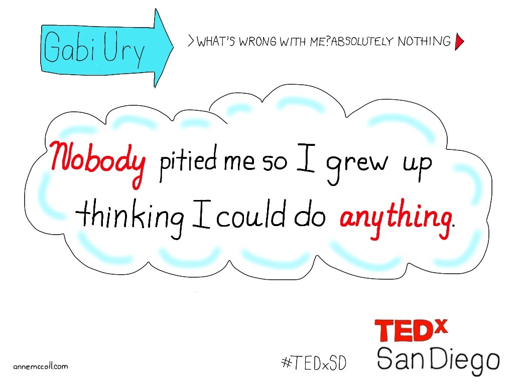
GUrhy_quote


Altucher_talk


Altucher_quote


make_chain


If you want more insights on storytelling and creativity in business, sign up for my newsletter!

Recap of TEDx San Diego 2010

Recap of TEDx San Diego 2011


Why words + visuals rule.

It's funny. As a writer, I am often the biggest proponent of visuals in web content. Clients ususally pay attention to the homepage but then after that, sometimes visuals get forgotten. But when text and visuals are paired together, they create a stronger message.

And if you have a lot to say, nothing is more intimidating than an entire page of text. Visuals help break up text into chunckable pieces that are easier to retain. 

text_vs_visuals
text_vs_visuals


You bet.

Writing is design.

You really can't do one without the other.

Update: Original source for stats for infographic. But the 60,000 stat has been proven bogus. Apparently my sketchnote has travelled around the Internet.


For more creative insights on storytelling, be sure to sign up for my not-too-frequent newsletter!

Happy creating!
anne_signature
anne_signature

Adobe Voice: Great for telling stories, not so great for sharing stories.

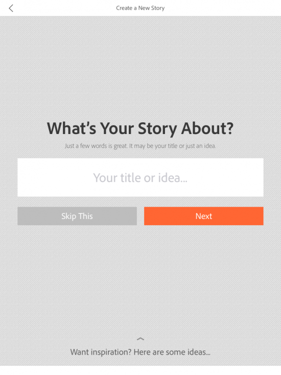
adobevoice Adobe released a new story telling app for the iPad called Adobe Voice. It’s a simple and really fun way to make voice-driven explainer videos.

You begin by recording a short audio recording. (Don’t worry, there’s a magic automatic make your voice sound better element included.) You can then add royalty free icons, photos or text—or you can upload photos from your iPad. You have a choice of 30 or so themes with set fonts and transitions and a limited selection of background music.

Here's a short video I created with Adobe Voice:

Simplicity = success. You’re only limited to a choice of 5 different layout per slide. While it would be nice to be able to tinker a bit more, the strength of Adobe Voice is in its simplicity. The average person will be able to create a nice looking video without knowledge of typography or design. There are even prompts that ask you about your story if you don’t know how to proceed. Yes, you can do a lot more with programs like iMovie, but Adobe Voice lets you create a beautiful piece in minutes.

Sharing is caring. To share your Adobe Voice video you have to upload it to Adobe’s servers requiring you to create an Adobe Cloud account. From there you can share on Facebook, Twitter or use an embed code. While the player page is beautiful, it gives you no indication of how many views. or where the video has been shared. I would really like to be able to save the videos onto a device (useful for kid’s homework) or to be able to upload to YouTube, to be able to leverage the searchability of the Internet’s second largest search engine.

Rating: Creative: Excellent Social: Fail


For more creative insights on storytelling, be sure to sign up for my not-too-frequent newsletter!

Happy creating!
anne_signature